Friday, 26 March 2010

Thursday, 18 March 2010
Cover ideas

Here is another idea for my front cover. Once again the cover is very simple with little pictures or text on the front. I want the main picture of the performers face to be the focus of the cover as it involves and entices the audience. In my final cover I will use a print screen of the performer as it shows a link between the video and digipak. In this idea I have moved the face from the side of the page to directly in the middle. Once again this is to draw attention to the face and make it obvious that this is my main focus. The text of the band's name will be in a distinctive text that is reflective of the band, but will be bold and simple. I believe that the draft of this cover looks good and with a little more detail it will interest the audience.
Wednesday, 17 March 2010
Album Cover Ideas

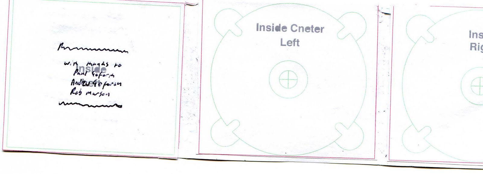
Here are some more ideas for my digipak. I have continued the theme of a face on the front cover as it is a very strong image which entices the target audience. I believe that this accompanied with the repeated name of the band gives a feeling repetition in life and how we all face it which reflects the lyrics well. I also think that only showing one eye connotates mystery and that we do not see the whole person, just bits of them. The back cover I want to be similiar to that of the front cover and connotate the same meanings. I think that added the back of the performers head creates a link from front to back and once again creates a sense of mystery. I also like the idea of the head on the front and back covers being placed on the side of the page. Many album covers have the person centralised within the cover, making the audience pay close attention to them. On the inside cover I have placed credits to the people that have aided me in the product. This is a typical convention of a album cover, with many artists and institutions paying credit to all the people who have helped them. Finally on the other inside cover I including images of crows flying and also stationary. Crows are a strong connatation of dark days and perhaps nothing being right in life. I wanted to give a feeling of life not quite living up to whay people think it is and can be sad at times.
Tuesday, 16 March 2010
Ancillary text
Here are a few ideas for the digipak CD/DVD cover I am going to produce. I plan to include some sort of collage of a face as it links in well with the theme of my video. I want the text to be very minimilistic with a white background and simple text.

This is one of my ideas, I believe the college of the face is very effective and goes well with the white background. I also like the idea of having the face partially covered as I believe it shows that every person has a hidden part to them. As I stated previously the cover is very simple, with the song named repeated.

This is one of my ideas, I believe the college of the face is very effective and goes well with the white background. I also like the idea of having the face partially covered as I believe it shows that every person has a hidden part to them. As I stated previously the cover is very simple, with the song named repeated.
Monday, 15 March 2010
Digipak introduction
In order to produce an effective digipak I would like to research the product and really get a feel as to what they are about. From reading up on the product I can see that it is very modern, and a useful tool in allowing the customer to get more than just a CD. The box itself is an obvious alternative to the traditional jewel box packaging. Rather than being made out of the common materials, the digipak is mostly made up of thick card. The card is a very useful product, as it can be manipulated into shape with very little effort, were as the standard CD must be moulded into shape which costs money and also time. Another great benefit is that the card is shatterproof preventing possible injuries. A major benefit for many leading companies is that the packaging can be produced at a reasonable price, similar to normal CDs. The digipak is an extremely effective and versitile product. It can accomidate booklets, CDs and DVDs, and allowing the number of panels to be dictated from four, six, eight or more. It is also preferred to the DVD packaging, mainly because it is much smaller and compact. The panels allow the companies to impliment special DVDs of the music, giving the customer something more. The DVDs are often included to make the customer feel like they are getting more for their money. Below is a traditional six panel digipak.


Thursday, 11 March 2010
Poster analysis
The next poster that I am going to analyse is advertising Green's Day's hit album American Idiot. This poster is identicle to the album cover, with a hand holding up a grenade in the shape of a heart. Both the poster and album cover have back and red themes, and also the same text. This leads me to the idea that the advertisements for albums are very similiar, or exactly the same, to the album cover. This is all for product recognition, for example when you see the poster on the street, the person will instantly recognise is in the shops and want to buy it. Below are both advertisements and album cover for the album.


Second Ancillary text
For my secondary ancillary text I have been askedto produce a magazine advert to support the release of the digipak. The advert must be relevant to first of all my music video and also the album covers I will produce. To produce an effective advert I am going to research previous ads and posters that have been released.
The first advertisement that I would like to analyse is The Stone Roses 20th anniversary album. Common to many of other advertisements the poster shown below is very simlilar to that of the album cover itself. One of the main aspects of the original album cover was the lemon theme. On the cover we see the O in roses replace by a lemon, which was an idea by Ian Brown when he was talkingto a French man in paris about how the riots had involved throwing lemons. This is continued in the poster, which is very central to the poster itself and instantly draws your attention. As well as this both the cover and poster have a map like picture on, making them both very similar. This may be because the album cover is instantly recocgnisable to all the fans of the band and that genre. So when viewing the poster the fans will instantly recocgnise it as the stone Roses. The poster and the original album cover are shown below.


The first advertisement that I would like to analyse is The Stone Roses 20th anniversary album. Common to many of other advertisements the poster shown below is very simlilar to that of the album cover itself. One of the main aspects of the original album cover was the lemon theme. On the cover we see the O in roses replace by a lemon, which was an idea by Ian Brown when he was talkingto a French man in paris about how the riots had involved throwing lemons. This is continued in the poster, which is very central to the poster itself and instantly draws your attention. As well as this both the cover and poster have a map like picture on, making them both very similar. This may be because the album cover is instantly recocgnisable to all the fans of the band and that genre. So when viewing the poster the fans will instantly recocgnise it as the stone Roses. The poster and the original album cover are shown below.


Subscribe to:
Posts (Atom)